Drayton Wiser
Simplifying complex heating products for confused customers.
Simplifying complex heating products for confused customers.
Simplifying complex heating products for confused customers.
Agency
Swanky
Role
Lead UX/UI Designer
Type
Smart Technology


The Challenge
When customers don't know what they don't know
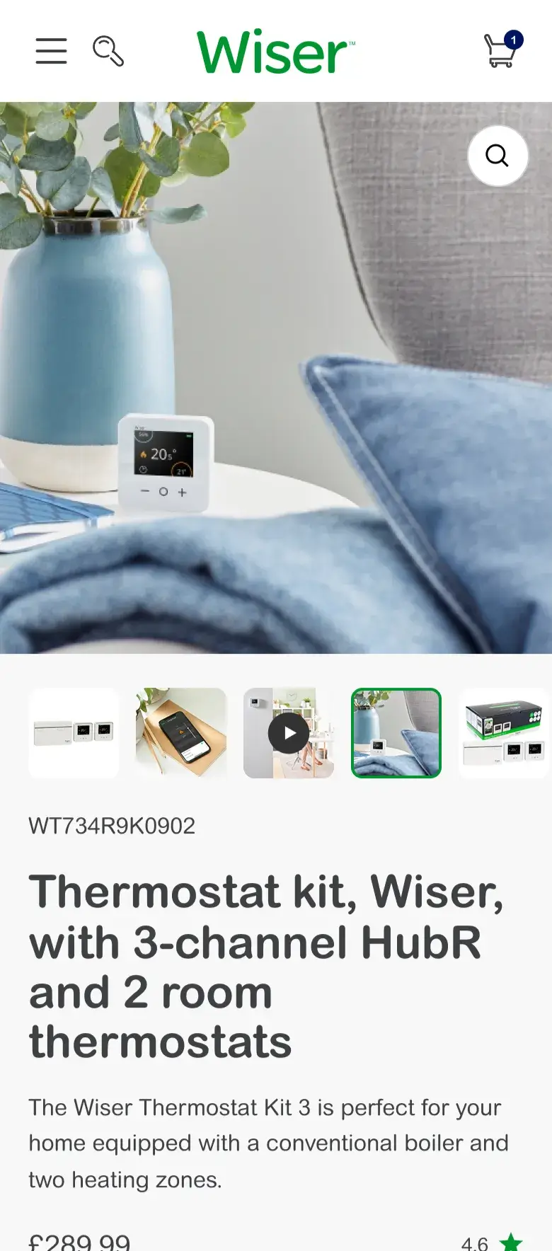
Wiser sells smart heating products: thermostats, controls, and kits that connect to home boilers. The problem wasn't the products themselves. It was that customers often couldn't answer the basic questions needed to buy them. What type of boiler do I have? How many heating circuits? Most new homeowners don't know. That knowledge gap was a barrier to conversion.
Without clear pathways through the complexity, customers either abandoned the journey or bought the wrong products, creating support burden and returns.
Stakes: Wrong purchases meant returns, support tickets, and customers frustrated before they'd even installed their heating system. Abandonment meant lost sales on high-value products.
Constraints: 8 week timeline, international stakeholders, native theme contraints, mixed audiences.


The Insights
Parallel pathways for different knowledge levels
The competitor landscape revealed a pattern: heating product experiences were either oversimplified (hiding necessary technical detail) or overcomplicated (overwhelming users with specifications). Neither approach served customers who didn't know their own boiler type.
Customers needed parallel pathways, not a single linear journey. Some would use the guided quiz. Others would browse and filter. Both groups needed consistent signposting and the same underlying logic, so whichever path they took, they'd reach the right product.
The Key Decisions
The Key Decisions
Creating clarity from technical complexity
Creating clarity from technical complexity
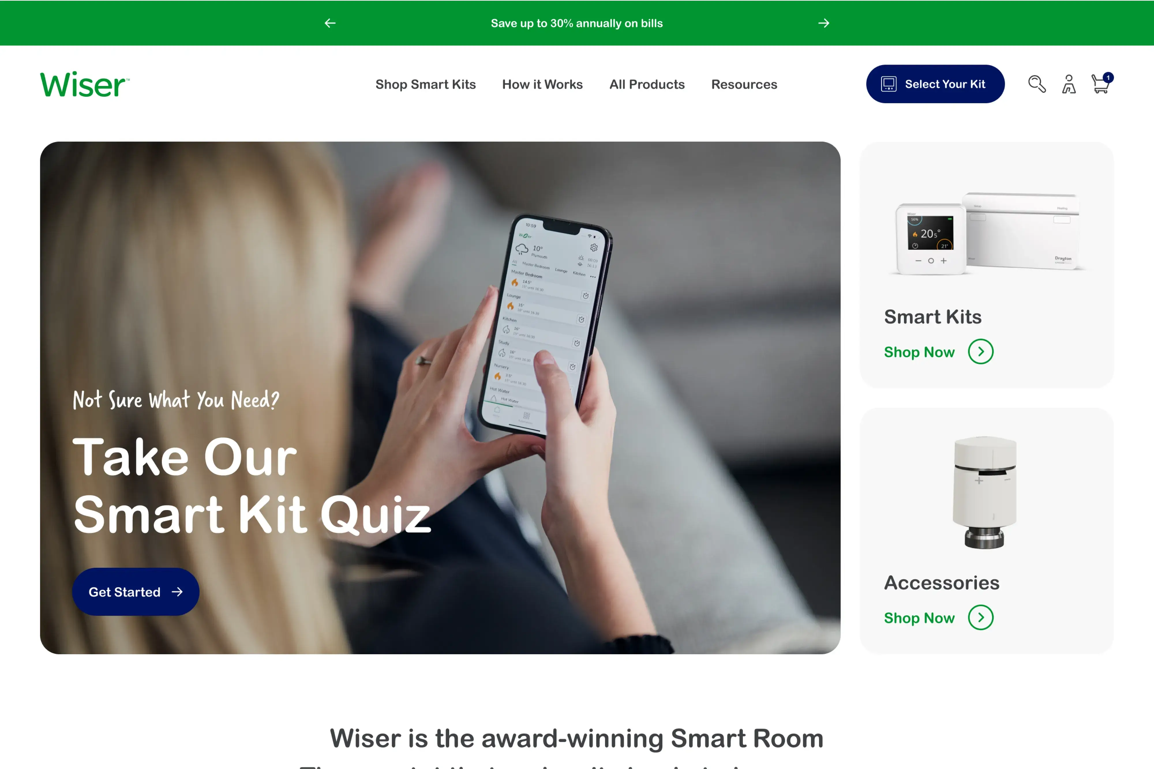
Decision 1
Restructured navigation to reduce cognitive load
The existing navigation had 8+ items with inconsistent language: "Find and Install," "Select Your Kit," "Buy Now." This created confusion about where to start and what each section contained.
I restructured to 5 focused items: Shop Smart Kits, How It Works, Accessories, Resources, Select Your Kit. The language choices were deliberate. "Select your kit" positioned the action as guided selection rather than transactional purchase. Every dropdown included quiz signposting.
Result: Clearer entry points with consistent pathways to the quiz throughout.
Decision 2
Designed collection filtering that mirrored quiz logic
Customers had two routes to products: a third-party quiz app, and browsing collections directly. These operated independently with no shared logic. Customers who'd been through the quiz found themselves starting over on collection pages.
I designed collection filtering that replicated the quiz structure: "Step 1: What's your boiler type? Step 2: What's your heating circuits?" Persistent signposting ("Not sure? Take our quiz") appeared throughout, acknowledging uncertainty without judgment.
Result: Parallel pathways with shared logic, meeting customers wherever they entered.
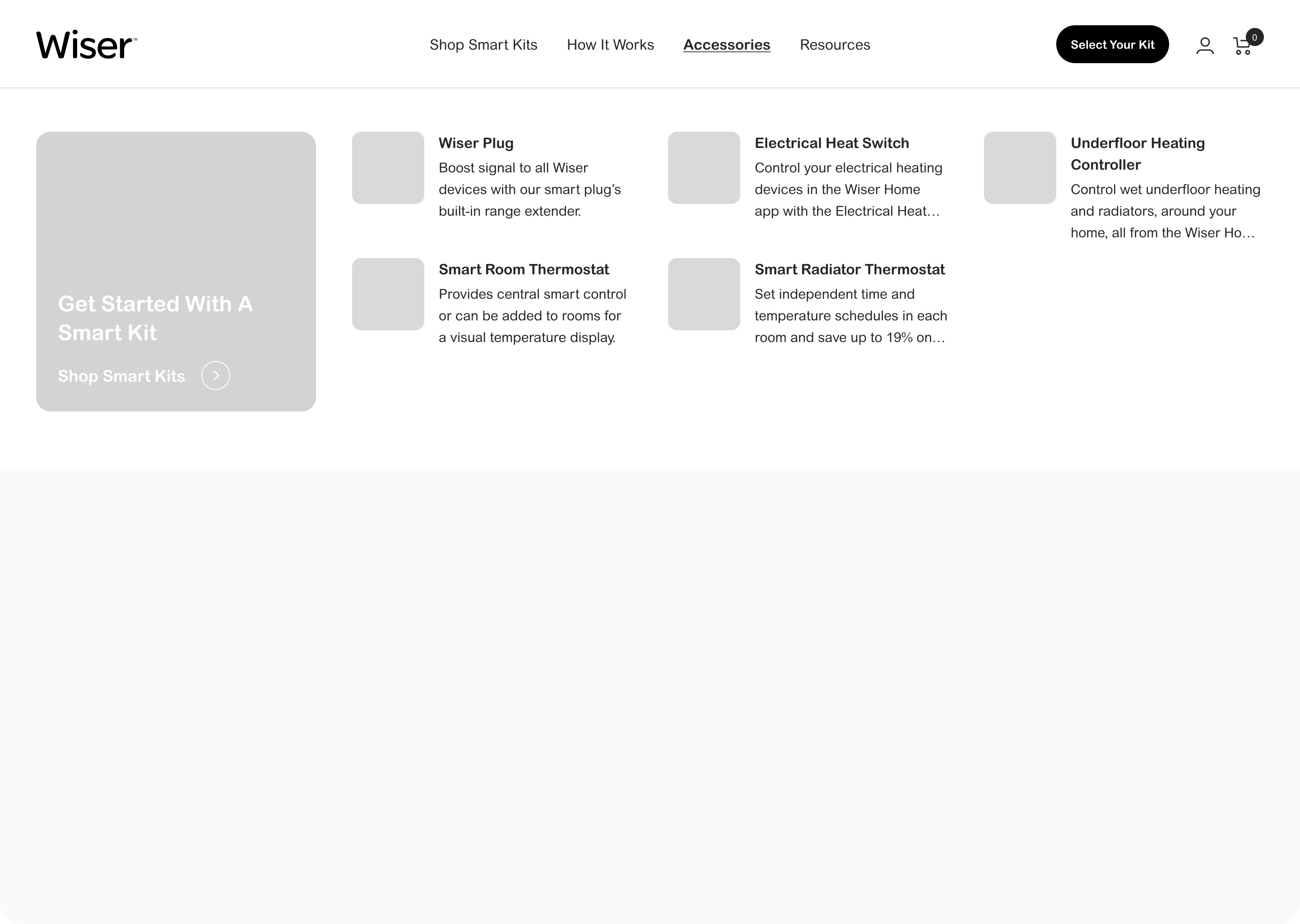
Decision 3
Redesigned mega menus as visual navigation
The existing mega menu had product images but poor hierarchy. Customers couldn't quickly identify what they needed, and quiz signposting was buried.
I redesigned with clear visual hierarchy: prominent quiz CTAs, "How it works" diagrams, product images with brand illustrations (Wiser's hand-drawn question marks, arrows, hearts). The visual style added warmth to technical content while signalling that guidance was available throughout the experience.
Result: Scannable navigation that guided customers toward discovery tools, not just products.
Decision 4
Surfaced critical specifications on product cards
Heating products require key specifications before purchase: room count, channel type, boiler compatibility. This information was either missing from collection pages or buried in product descriptions.
I designed custom product cards surfacing critical specs upfront. Hover states revealed lifestyle imagery and colour transitions. The card pattern worked across smart kits and accessories, providing consistency while highlighting what mattered for purchase decisions at the browsing stage.
Result: Customers could assess compatibility without clicking through to every product page.

The Work
The Work
Dual pathways, consistent logic
The design created two routes to the same destination. Customers confident in their requirements could browse collections with structured filtering. Customers uncertain about boiler types could take the quiz and receive recommendations.
Both paths used the same underlying logic. Filtering questions on collection pages matched quiz questions. Product cards displayed the same specifications the quiz used to make recommendations. A customer could start with the quiz, land on a collection, and recognise the terminology.
Content architecture
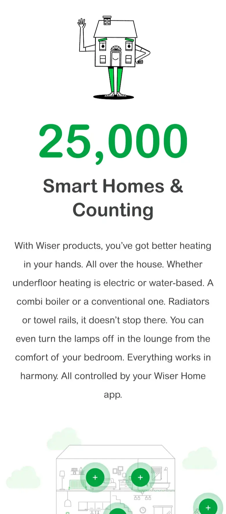
The navigation restructure went beyond labels. Each section needed clear purpose: "Shop Smart Kits" for guided purchase, "How It Works" for education, "Accessories" for add-ons. The mega menu became a discovery tool, with quiz signposting in every dropdown, visual product identification for accessories, and the "How it works" diagram accessible from multiple entry points.
Content layering throughout the site ensured customers who didn't engage immediately still received educational content. USPs, video explanations, and "Why choose Wiser" sections were positioned below primary product content. Customers ready to buy weren't slowed down. Customers needing convincing found the information without leaving the purchase flow.
The design created two routes to the same destination. Customers confident in their requirements could browse collections with structured filtering. Customers uncertain about boiler types could take the quiz and receive recommendations.
Both paths used the same underlying logic. Filtering questions on collection pages matched quiz questions. Product cards displayed the same specifications the quiz used to make recommendations. A customer could start with the quiz, land on a collection, and recognise the terminology.
Content architecture
The navigation restructure went beyond labels. Each section needed clear purpose: "Shop Smart Kits" for guided purchase, "How It Works" for education, "Accessories" for add-ons. The mega menu became a discovery tool, with quiz signposting in every dropdown, visual product identification for accessories, and the "How it works" diagram accessible from multiple entry points.
Content layering throughout the site ensured customers who didn't engage immediately still received educational content. USPs, video explanations, and "Why choose Wiser" sections were positioned below primary product content. Customers ready to buy weren't slowed down. Customers needing convincing found the information without leaving the purchase flow.

The Complication
Navigating stakeholder perspectives
Two primary stakeholders channelled feedback from additional voices, each with different priorities. Some focused on installer relationships, others on consumer experience, others on app subscription growth. Design sessions required balancing these perspectives while maintaining focus on the core user journey.
Competing priorities surfaced in extended discussions. The solution needed to serve all audiences without fragmenting the experience. This meant finding the overlap: where installer needs and consumer needs aligned, rather than creating separate experiences.
Mid-project pivot
Original wireframes recommended rich collection pages as the primary discovery experience, essentially replicating quiz functionality within the browse flow. Stakeholder feedback pushed toward maintaining distinct landing pages with collection filtering as secondary support.
Wireframes were revised mid-project, simplifying the collection experience while strengthening quiz signposting. The pivot required updating designs and recalibrating client expectations, managed through transparent communication about why the change was happening and what it meant.
The Complication
Navigating stakeholder perspectives
Two primary stakeholders channelled feedback from additional voices, each with different priorities. Some focused on installer relationships, others on consumer experience, others on app subscription growth. Design sessions required balancing these perspectives while maintaining focus on the core user journey.
Competing priorities surfaced in extended discussions. The solution needed to serve all audiences without fragmenting the experience. This meant finding the overlap: where installer needs and consumer needs aligned, rather than creating separate experiences.
Mid-project pivot
Original wireframes recommended rich collection pages as the primary discovery experience, essentially replicating quiz functionality within the browse flow. Stakeholder feedback pushed toward maintaining distinct landing pages with collection filtering as secondary support.
Wireframes were revised mid-project, simplifying the collection experience while strengthening quiz signposting. The pivot required updating designs and recalibrating client expectations, managed through transparent communication about why the change was happening and what it meant.

The Delivery
Design handoff
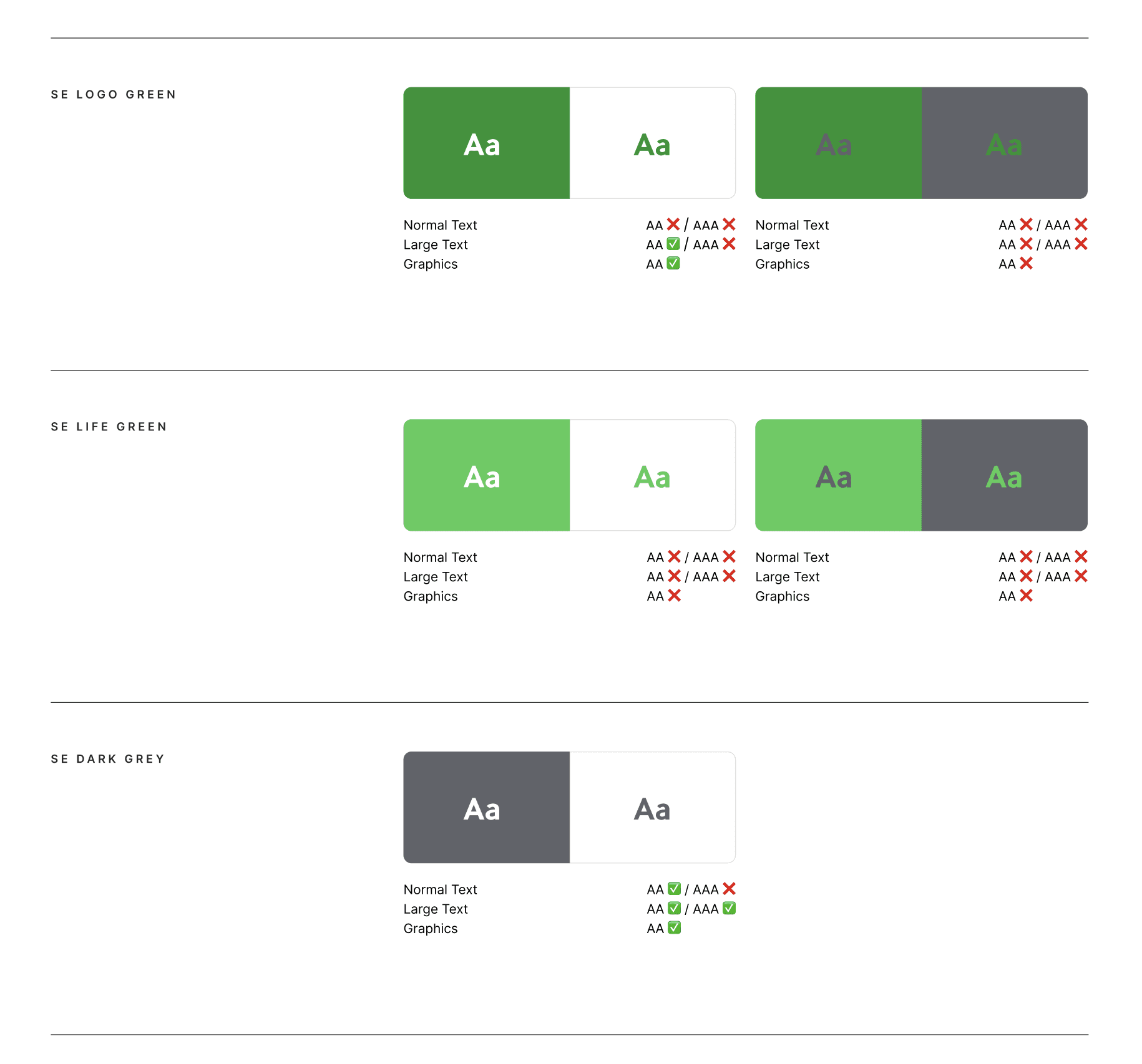
Figma files were structured to align with Impact theme architecture: consistent spacing, documented grid behaviour, and component sizing matched to known theme constraints. While the project didn't proceed to build, designs were signed off with accurate specifications and responsive behaviour documented.
The handoff documentation distinguished native theme functionality from custom requirements, so any future development would have clear guidance.
The Results
Strategic solution, deferred implementation
This project was designed and signed off but didn't proceed to development. A client-side decision unrelated to design quality.
The work demonstrates complex product information architecture, multi-stakeholder navigation, and strategic content hierarchy within platform constraints.
Week delivery, including mid-project wireframe restructure based on stakeholder feedback.
Week delivery, including mid-project wireframe restructure based on stakeholder feedback.
Conversion flows with shared underlying logic, meeting users wherever they entered.
Conversion flows with shared underlying logic, meeting users wherever they entered.

Let's get the conversation started.
I work with a small number of brands at a time so I can give each project the attention it needs. Whether you're planning a full redesign or looking to improve what you've got, a quick call is the easiest way to see if we're a good fit.
Get In Touch
